Subscribe here to stay updated on coming posts.
Imagine you’re curious about a dataset you created and curated. So much work! And now you get to present it in front of a crowd, or write it down in a report. How To Do?!
Say: You have a list of catalyst supports and know that each plays a part in a “larger” class of reactions—like characters in a play. For example, graphene being a carbon support (or, a bunch of organic chemistry reactions that can broadly be catergorized into higher-level sections such as carbonyl chemistry, radical chemistry, … etc.). Conveniently, for example, you created a dictionary mapping a support to a cluster.
# Your hand-(or machine-)made dictionary assigning each support to a cluster

cluster_dictionary = {
"alumina": [ "m-Al2O3", "zeolite HZSM-5"],
"carbon": ["carbon nanofibers", "mesoporous polymeric graphitic carbon nitride (mpg-C3N4)", "nitrogen-doped graphene"],
"ceria": ["CeO2"],
"other": ["Au", "Fe2O3"]
}

# Could also be something like
# cluster_dictionary = {
# "radical chemistry": ["hydrochlorination", "alpha-elimination"],
# "carbonyl chemistry": ["transesterification", "carbonyl reduction"],
# ... }
# Your example data
example_data = ['m-Al2O3', 'CeO2', 'carbon nanofibers', 'nitrogen-doped graphene', 'nitrogen-doped graphene', 'carbon nanofibers', 'carbon nanofibers', 'm-Al2O3']After some preprocessing, your data might look like this (see below for a data preprocessing tutorial):
>>> data_df
                      Item  Cluster  Count
0                  m-Al2O3  alumina      2
1                     CeO2    ceria      1
2        carbon nanofibers   carbon      3
3  nitrogen-doped graphene   carbon      2
How do you organize this “cast” of characters without overwhelming the viewer or crowding the plot? How do we visualize this – Perhaps with a histogram? Coloring each bar according to their cluster assignment?
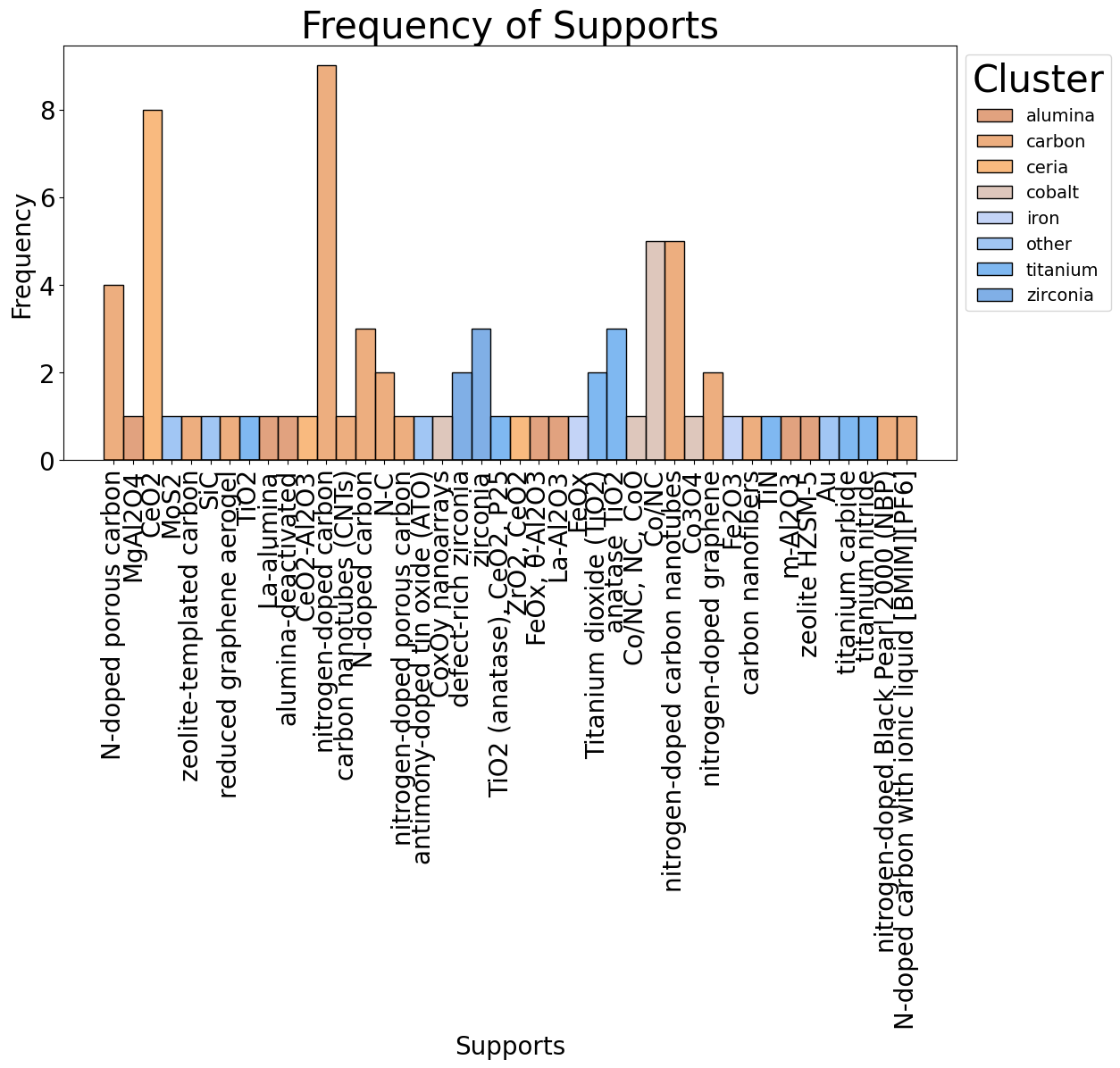
Histogram of “my” data (larger than the example), corresponding to catalyst supports that belong to a specific super-cluster.
That looks, ehh, ugly… let’s “prettify” this figure.
We will use… a sunburst chart! It is a way of visualizing hierarchical data, or data belonging to multiple categories. Each “onion shell” of the plot corresponds to a specific category. In our case, the middle corresponds to the clusters, the bottom to the individual datapoints:
import plotly.express as px

# Create sunburst chart
fig = px.sunburst(
    data_df,
    path=["Cluster", "Item"],
    values="Count",
    title="Catalyst Supports",
)

# Save the figure
fig.write_image("my_first_sunburst.png")
# You can also take a look instantly with fig.show()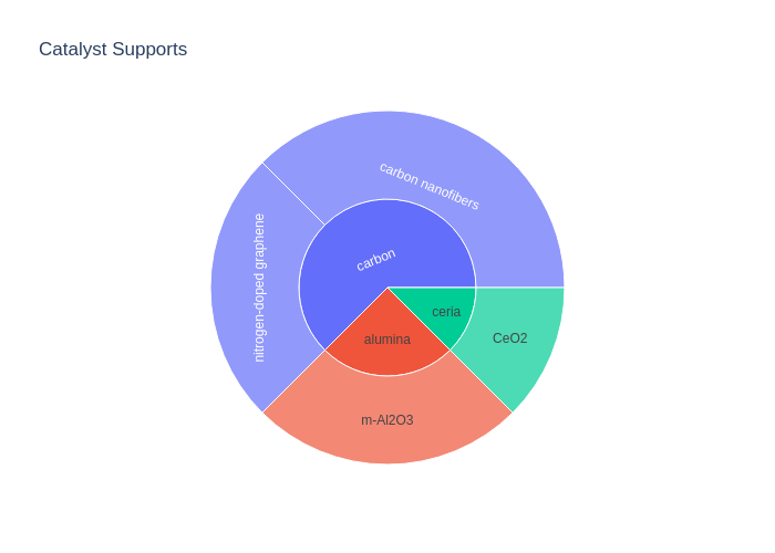
Your first sunburst chart. Woohoo! With the default layout, though.
Nice, right? However, we’re kinda loosing track of the count of datapoints along the way. Let’s fix this by displaying it in the Cluster Label:
# Include the number of data points right in the cluster label
cluster_counts = data_df.groupby("Cluster")["Count"].sum()
data_df["Cluster_With_Counts"] = data_df["Cluster"].map(lambda x: f"{x} ({cluster_counts[x]})")

# Add to sunburst chart
fig = px.sunburst(
    ...
    path=["Cluster_With_Counts", "Item"],
    ...
)

# Save the figure
fig.write_image("my_first_sunburst.png")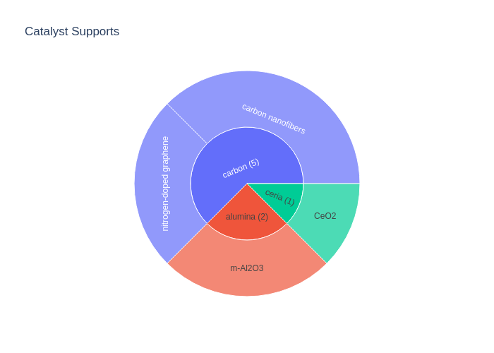
Customization Step 1: Adding the counts
Lastly, I like an aesthetic color scheme and LARGE text sizes, so let’s add that by modifying your favorite seaborn color palette (you can also assign individual colors, see documentation):
# Define the number of unique clusters for our color palette
unique_clusters = data_df["Cluster"].nunique()

# Palette from Seaborn to color each cluster
import seaborn as sns
colors = sns.color_palette("magma", unique_clusters)

# Link our clusters to the Magma colors
color_map = {cluster: f"rgb({int(r*255)}, {int(g*255)}, {int(b*255)})" for cluster, (r, g, b) in zip(data_df["Cluster"].unique(), colors)}

# Add to sunburst chart
# Add to sunburst chart
fig = px.sunburst(
    ...
    color_discrete_map=color_map,
    ...
)

# Apply larger fontsize
fig.update_layout(font_size=16)

# Save the figure
fig.write_image("my_first_sunburst.png")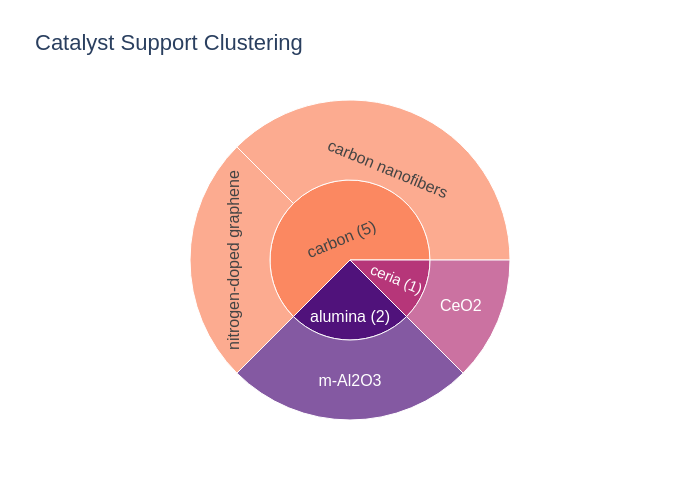
Customization Step 2: Custom color scheme
Giving us this function (please use docstrings and typehints, folks!):
import seaborn as sns
import pandas as pd
import plotly.express as px

def create_sunburst_chart(data_df: pd.DataFrame, filename: str) -> None:
    """
    Generate a sunburst chart using a discrete Magma color scheme from Seaborn.

    Args:
        data_df (pd.DataFrame): DataFrame containing "Item", "Cluster", and "Count".

    Returns:
        None, displays the chart.
    """
    # Define the number of unique clusters
    unique_clusters = data_df["Cluster"].nunique()

    # Get a list of colors from the Magma palette
    colors = sns.color_palette("magma", unique_clusters)

    # Create a color map linking clusters to colors
    color_map = {cluster: f"rgb({int(r*255)}, {int(g*255)}, {int(b*255)})" for cluster, (r, g, b) in zip(data_df['Cluster'].unique(), colors)}

    # Aggregate count by cluster
    cluster_counts = data_df.groupby("Cluster")["Count"].sum()

    # Update cluster names in the DataFrame to include the count
    data_df["Cluster_With_Counts"] = data_df["Cluster"].map(lambda x: f"{x} ({cluster_counts[x]})")


    # Plotting with Plotly
    fig = px.sunburst(
        data_df,
        path=["Cluster_With_Counts", "Item"],
        values="Count",
        title="Catalyst Support Clustering",
        color="Cluster",  # Can also be assigned according to 'Count' or another column; in that case set a continuous color_map
        color_discrete_map=color_map
    )
    fig.update_layout(font_size=16)
    fig.savefig(filename) # can be png or svg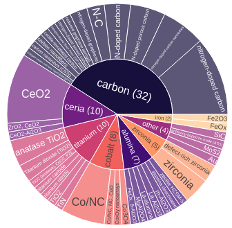
Looks better than the histogram before, right?
There are many ways to customize these charts further. For example, I can add “intermediate” clusters such as titanium oxide (TiO2), titanium nitride and titanium carbide, to segment the data further. We can also see at once that the carbon supports is highly represented in the dataset with 32 entries — whereas MoS2 or SiC only constitute 1 datapoint each. So, I probably know to be critical when my machine learning model exclusively predicts “carbon” in the majority of cases. Anyway!
See here for further customization:
- Generating Sunburst Charts with Plotly
- Color Palettes by Seaborn
- Inkscape for visualizing and editing vector graphics
Until the next time! 👋👋
Subscribe here to stay updated on coming posts.
P.S.: If your data is contained in a different format: data preprocessing… The least fun part.
# Your hand-(or machine-)made dictionary assigning each support to a cluster
cluster_dictionary = {
"alumina": [ "m-Al2O3", "zeolite HZSM-5"],
"carbon": ["carbon nanofibers", "mesoporous polymeric graphitic carbon nitride (mpg-C3N4)", "nitrogen-doped graphene"],
"ceria": ["CeO2"],
"other": ["Au", "Fe2O3"]
}

# Could also be something like
# cluster_dictionary = {
# "radical chemistry": ["hydrochlorination", "alpha-elimination"],
# "carbonyl chemistry": ["transesterification", "carbonyl reduction"],
# ... }
Say, our dataset contains all of the supports in the dataset, multiple times.
>>> example_data
['m-Al2O3', 'CeO2', 'carbon nanofibers', 'nitrogen-doped graphene', 'nitrogen-doped graphene', 'carbon nanofibers', 'carbon nanofibers', 'm-Al2O3']
Construct the dataframe with this code:
item_assigned_to_cluster = {item: cluster for cluster, items in cluster_dictionary.items() for item in items}>>> item_assigned_to_cluster
{'m-Al2O3': 'alumina', 'zeolite HZSM-5': 'alumina', 'carbon nanofibers': 'carbon', 'mesoporous polymeric graphitic carbon nitride (mpg-C3N4)': 'carbon', 'nitrogen-doped graphene': 'carbon', 'CeO2': 'ceria', 'Au': 'other', 'Fe2O3': 'other'}# Create a DataFrame for plotting
import pandas as pd
data_df = pd.DataFrame(
{"Item": example_data, "Cluster": [item_assigned_to_cluster.get(item, "other") for item in example_data]}
)
# Calculate the frequency of each item
data_df['Count'] = data_df.groupby('Item')['Item'].transform('count')
# Drop duplicates to avoid counting items multiple times
data_df = data_df.drop_duplicates(subset=['Item'])Our dataframe now looks like this:
>>> data_df
Item Cluster Count
0 m-Al2O3 alumina 2
1 CeO2 ceria 1
2 carbon nanofibers carbon 3
3 nitrogen-doped graphene carbon 2